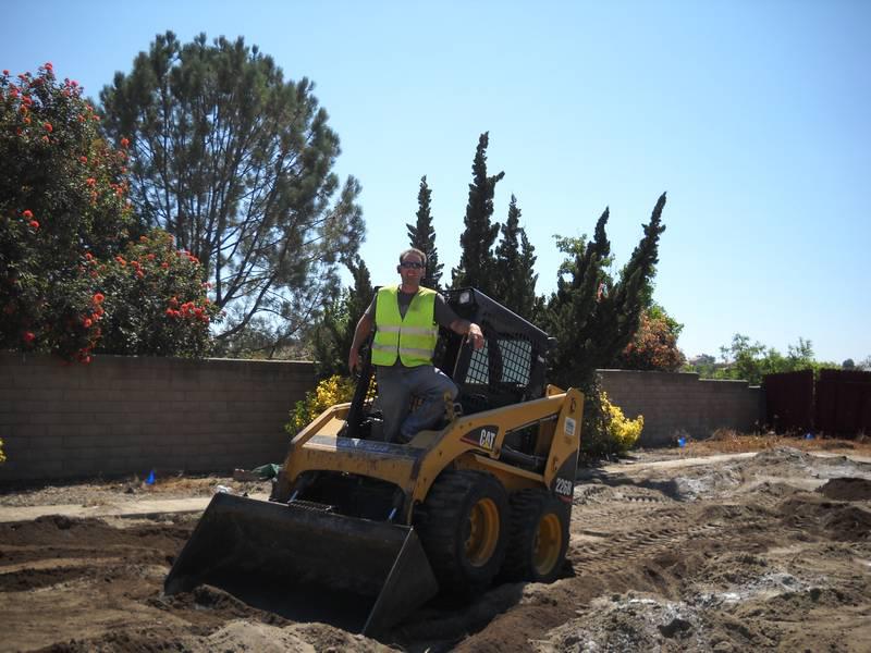
Landscape & Beyond-how we started

Cousin Jeff has been in the landscape industry since 1998. He started from his family members being active in the industry. He started off working for them and learning the trade. At the age of 12 he was working the landscape maintenance side by getting dropped off on a job sites and pulling weeds and cleaning leaves.
Time goes on and Jeff is running a 150 acre project at 16 years old. Soon two years later, he is leading the landscape maintenance division in San Diego. By then I had a few solid years in the trade and moves to doing landscape construction side installing irrigation.
Featured News
Design & Features
Menu Styles
JSN Megazine provides 5 menu styles to present your website navigation. The default Joomla! built-in menu module (mod_mainmenu) is utilized, so you don't need to install any external menu modules.
Top Menu
![]()
Top Menu allows you to arrange menu items in horizontal line and assign icons to them. All icons are configured directly in menu item settings page which is very convenient.
Main Menu

Main Menu is very powerful menu built with clean accessible XHTML code structure and effective drop-down submenu panels.
Main Menu with icons and rich text
![]()
You can add icon and descriptive text to each menu item to make them much clearer and more appealing. Both descriptive text and icons are configured directly in menu item settings page, which is very convenient.
Side Menu

Side Menu is very unique vertical menu with slide-out panels. This menu is extremely efficient when you have complex navigation with a lot of menu items.
Tree Menu

Tree Menu represents menu items in clear tree-like hierarchy, which is very appropriate for indexing menu. By default all submenu items are collapsed until you select the parent menu item.
Div Menu

Div Menu is simple yet nice menu bar with items separated by slightly visible dashes. This menu is very suitable for footer navigation presentation.
Typography
JSN Megazine was developed with extreme focus on typography and we believe it provides the most comprehensive content presentation capability. Headings, text, links, tables, images, everything was designed with high level of refinement. Let's take a look.
Headings
This is an H1 Header
Lorem ipsum dolor sit amet consectetuer eleifend elit vel tellus laoreet. At ut pellentesque risus quis sem eros et consequat enim lorem. Aenean lorem consequat consequat eu.
This is an H2 Header
Lorem ipsum dolor sit amet consectetuer eleifend elit vel tellus laoreet. At ut pellentesque risus quis sem eros et consequat enim lorem. Aenean lorem consequat consequat eu.
This is an H3 Header
Lorem ipsum dolor sit amet consectetuer eleifend elit vel tellus laoreet. At ut pellentesque risus quis sem eros et consequat enim lorem. Aenean lorem consequat consequat eu.
This is an H4 Header
Lorem ipsum dolor sit amet consectetuer eleifend elit vel tellus laoreet. At ut pellentesque risus quis sem eros et consequat enim lorem. Aenean lorem consequat consequat eu.
This is an H5 Header
Lorem ipsum dolor sit amet consectetuer eleifend elit vel tellus laoreet. At ut pellentesque risus quis sem eros et consequat enim lorem. Aenean lorem consequat consequat eu.
This is an H6 Header
Lorem ipsum dolor sit amet consectetuer eleifend elit vel tellus laoreet. At ut pellentesque risus quis sem eros et consequat enim lorem. Aenean lorem consequat consequat eu.
Text columns
You can arrange content in multiple columns by using very simple html code. JSN Megazine will detect the amount of columns you defined and automatically make arrangement.
Usage: <div class=”grid-layout”><div>Text in column 1</div><div>Text in column 2</div></div>
Content arranged in 2 columns
Text column
Lorem ipsum dolor sit amet consectetuer eleifend elit vel tellus laoreet. At ut pellentesque risus quis sem eros et consequat enim lorem. Aenean lorem consequat consequat eu.
Text column
Lorem ipsum dolor sit amet consectetuer eleifend elit vel tellus laoreet. At ut pellentesque risus quis sem eros et consequat enim lorem. Aenean lorem consequat consequat eu.
Content arranged in 3 columns
Text column
Lorem ipsum dolor sit amet consectetuer eleifend elit vel tellus laoreet. At ut pellentesque risus quis sem eros et consequat enim lorem. Aenean lorem consequat consequat eu.
Text column
Lorem ipsum dolor sit amet consectetuer eleifend elit vel tellus laoreet. At ut pellentesque risus quis sem eros et consequat enim lorem. Aenean lorem consequat consequat eu.
Text column
Lorem ipsum dolor sit amet consectetuer eleifend elit vel tellus laoreet. At ut pellentesque risus quis sem eros et consequat enim lorem. Aenean lorem consequat consequat eu.
Content arranged in 4 columns
Text column
At ut pellentesque risus quis sem eros et consequat enim lorem. Aenean lorem consequat consequat eu.
Text column
At ut pellentesque risus quis sem eros et consequat enim lorem. Aenean lorem consequat consequat eu.
Text column
At ut pellentesque risus quis sem eros et consequat enim lorem. Aenean lorem consequat consequat eu.
Text column
At ut pellentesque risus quis sem eros et consequat enim lorem. Aenean lorem consequat consequat eu.
Content arranged in 5 columns
Text column
Lorem ipsum dolor sit amet consectetuer eleifend elit vel tellus laoreet.
Text column
Lorem ipsum dolor sit amet consectetuer eleifend elit vel tellus laoreet.
Text column
Lorem ipsum dolor sit amet consectetuer eleifend elit vel tellus laoreet.
Text column
Lorem ipsum dolor sit amet consectetuer eleifend elit vel tellus laoreet.
Text column
Lorem ipsum dolor sit amet consectetuer eleifend elit vel tellus laoreet.
Text styles
Preformatted text (<pre> tag)
div.grid-layout2 div.grid-col {
 float: left;
 width: 49.95%;
}
div.grid-layout3 div.grid-col {
 float: left;
 width: 33.3%;
}
Quote text (<blockquote> tag)
You can us this style to quote somebody's speech, idea or a fragment from some book, articles, etc. Lorem ipsum dolor sit amet consectetuer eleifend elit vel tellus laoreet. At ut pellentesque risus quis sem eros et consequat enim lorem. Aenean lorem consequat consequat eu.
Usage: <blockquote>This is your quote</blockquote>
Drop Cap
You can use this special drop cap symbol style for magazine / newspaper text paragraph. Lorem ipsum dolor sit amet consectetuer eleifend elit vel tellus laoreet. At ut pellentesque risus quis sem eros et consequat enim lorem. Aenean lorem consequat consequat eu.
Usage: <p class="text-dropcap">This is the text with dropcap symbol.</p>
Highlighted Text
You can use this style to highlight important words and / or keyword expression in search result page. Lorem ipsum dolor sit amet consectetuer eleifend elit vel tellus laoreet. At ut pellentesque risus quis sem eros et consequat enim lorem. Aenean lorem consequat consequat eu.
Usage: <span class="text-highlight">This is the text to be highlighted.</span>
Highlighted Text on mouse over
You can use this style to highlight important text block on mouse over. Just roll mouse over this text block to see how it's highlighted.
Usage: <div class="text-box-highlight">This is the text to be highlighted.</div>
You can use this style to highlight important text block on mouse over. Just roll mouse over this text block to see how it's highlighted.
Usage: <div class="text-box-highlight">This is the text to be highlighted.</div>
Alert Text
You can use this style for alert or warning text paragraph requiring user's attention. At ut pellentesque risus quis sem eros et consequat enim lorem. Aenean lorem consequat consequat eu.
Usage: <p class="text-alert">This is text that requires user's attentions.</p>
Info Text
You can use this style for regular information text paragraph that does not require much user's attentions. At ut pellentesque risus quis sem eros et consequat enim lorem. Aenean lorem consequat consequat eu.
Usage: <p class="text-info">This is your d text.</p>
Download Text
You can use this style for information text paragraph related to download process. At ut pellentesque risus quis sem eros et consequat enim lorem. Aenean lorem consequat consequat eu.
Usage: <p class="text-download">This is download related text.</p>
Tip Text
You can use this style for useful information like tips, hint or help text. At ut pellentesque risus quis sem eros et consequat enim lorem. Aenean lorem consequat consequat eu.
Usage: <p class="text-tip">This is yourtip hint or help text.</p>
Comment Text
Attachment Text
Video Text
You can use this style for description text paragraph that related to video file. At ut pellentesque risus quis sem eros et consequat enim lorem. Aenean lorem consequat consequat eu.
Usage: <p class="text-video">This is your video related text.</p>
Audio Text
You can use this style for description text paragraph related to audio file. At ut pellentesque risus quis sem eros et consequat enim lorem. Aenean lorem consequat consequat eu.
Usage: <p class="text-audio">This is your audio related text.</p>
Link Styles
Link Icon Styles
You can attach up to 450 predefined icons to the front of any link by adding simple class to it.
Usage: <a class="link-icon jsn-icon-xxx">This is link text.</a>, where xxx is the name of icon to be applied. Detailed information about all icon names can be found in template documentation.
Example: <a class="link-icon jsn-icon-download">This is link to download something.</a>
Link Button Styles
JSN Megazine offers 06 button styles to decorate any call-to-action links you have in the content.
Usage: <a class="link-button button-xxx">This is link text.</a>, where xxx is the button color name selected from: light, dark, green, orange, blue and red.
Example: <a class="link-button button-orange">See plans & pricing.</a>
Combination of Button and Icon Styles
You can use both button and icon link style combined.
Usage: <a class="link-button button-xxx"><span class="link-icon jsn-icon-yyy">This is link text.</span></a>, where xxx and yyy are button color and icon names respectively.
Example: <a class="link-button button-green"><span class="link-icon jsn-icon-cart">Add to cart.</span></a>
Extension link styles
JSN Megazine is able to attach not only descriptive icon to the front of link as described in above section, but also 23 extension icons to the end of the link.
All icons can be assigned automatically by enabling a template parameter or manually by adding simple class to the link.
Usage: <a class="link-icon-ext jsn-icon-ext-xxx">This is link text.</a>, where xxx is the icon name. Detailed information about all icon names can be found in template documentation.
Table Styles
Plain Rows table style
| Table header | Column header 1 | Column header 2 | Column header 3 |
|---|---|---|---|
| Row header 1 | Lorem ipsum | Dolor sit amet | Lorem ipsum |
| Row header 1 | Lorem ipsum | Dolor sit amet | Lorem ipsum |
| Row header 1 | Lorem ipsum | Dolor sit amet | Lorem ipsum |
| Row header 1 | Lorem ipsum | Dolor sit amet | Lorem ipsum |
| Row header 1 | Lorem ipsum | Dolor sit amet | Lorem ipsum |
| Table footer | Footer data | ||
Color Stripes table style
| Table header | Column header 1 | Column header 2 | Column header 3 |
|---|---|---|---|
| Row header 1 | Lorem ipsum | Dolor sit amet | Lorem ipsum |
| Row header 1 | Lorem ipsum | Dolor sit amet | Lorem ipsum |
| Row header 1 | Lorem ipsum | Dolor sit amet | Lorem ipsum |
| Row header 1 | Lorem ipsum | Dolor sit amet | Lorem ipsum |
| Row header 1 | Lorem ipsum | Dolor sit amet | Lorem ipsum |
| Table footer | Footer data | ||
Grey Stripes table style
| Table header | Column header 1 | Column header 2 | Column header 3 |
|---|---|---|---|
| Row header 1 | Lorem ipsum | Dolor sit amet | Lorem ipsum |
| Row header 1 | Lorem ipsum | Dolor sit amet | Lorem ipsum |
| Row header 1 | Lorem ipsum | Dolor sit amet | Lorem ipsum |
| Row header 1 | Lorem ipsum | Dolor sit amet | Lorem ipsum |
| Row header 1 | Lorem ipsum | Dolor sit amet | Lorem ipsum |
| Table footer | Footer data | ||
List styles
Standard list styles
Unordered list
- Lorem ipsum dolor sit amet
- Consetetur sadipscing elitr
- Sed diam voluptua
Ordered list
- Lorem ipsum dolor sit amet
- Consetetur sadipscing elitr
- Sed diam voluptua
Arrow list styles
Red arrow
- Lorem ipsum dolor sit amet
- Consetetur sadipscing elitr
- Sed diam voluptua
Blue arrow
- Lorem ipsum dolor sit amet
- Consetetur sadipscing elitr
- Sed diam voluptua
Green arrow
- Lorem ipsum dolor sit amet
- Consetetur sadipscing elitr
- Sed diam voluptua
Number list styles
Blue Bullet number list
- Lorem ipsum dolor sit amet
- Consetetur sadipscing elitr
- Sed diam voluptua
Green Bullet number list
- Lorem ipsum dolor sit amet
- Consetetur sadipscing elitr
- Sed diam voluptua
Violet Bullet number list
- Lorem ipsum dolor sit amet
- Consetetur sadipscing elitr
- Sed diam voluptua
Orange Bullet number list
- Lorem ipsum dolor sit amet
- Consetetur sadipscing elitr
- Sed diam voluptua
Red Bullet number list
- Lorem ipsum dolor sit amet
- Consetetur sadipscing elitr
- Sed diam voluptua
Grey Bullet number list
- Lorem ipsum dolor sit amet
- Consetetur sadipscing elitr
- Sed diam voluptua
Blue Digit number list
- Lorem ipsum dolor sit amet
- Consetetur sadipscing elitr
- Sed diam voluptua
Green Digit number list
- Lorem ipsum dolor sit amet
- Consetetur sadipscing elitr
- Sed diam voluptua
Violet Digit number list
- Lorem ipsum dolor sit amet
- Consetetur sadipscing elitr
- Sed diam voluptua
Orange Digit number list
- Lorem ipsum dolor sit amet
- Consetetur sadipscing elitr
- Sed diam voluptua
Red Digit number list
- Lorem ipsum dolor sit amet
- Consetetur sadipscing elitr
- Sed diam voluptua
Grey Digit number list
- Lorem ipsum dolor sit amet
- Consetetur sadipscing elitr
- Sed diam voluptua
Module Styles
JSN Megazine provides 06 box designs for module background styling, which can be combined with 450 predefined icons for module title styling. Take a look around to see how module styles are applied.
Module styles are configured by module's parameter Module Class Suffix with very simple syntax. To set up icons, you need to add string jsn-icon-xxx to module class suffix, where xxx is the icon name.
TRENDING NEWS FLASHS
Now is the time to configure your surroundings into a Water-Wise landscape showcase. Landscape and Beyond can help you get started.
You may qualify for rebates by applying at http://www.socalwatersmart.com/. Read the article at the left on Water Saving Resources for more tips, ideas, and resources to help you save water.
Free Estimates
Free Estimates! It's time to do some water wise renovations in the yard. Remove the grass, conserve water and save money.
Contact Jeff to learn more.
760-877-8739
This email address is being protected from spambots. You need JavaScript enabled to view it.
At Landscape and Beyond we pride ourselves by serving our clients with professional integrity and hard work. We feel it is important to build a strong working relationship with our customers to make your vision happen. Landscape and Beyond’s extensive knowledge provides excellent service at affordable prices.
Our mission is to increase the value of your home, create an inviting quality landscape, and maintain environmentally responsibility and the unique reflections of our clients. Long term satisfaction is our success.
Landscape and Beyond
760-877-8739
jeff@landscapeandbeyond.com


You can use this style for comment text paragraph. At ut pellentesque risus quis sem eros et consequat enim lorem. Aenean lorem consequat consequat eu.
Usage: <p class="text-comment">This is your comment text.</p>